
Skew-T Plots
2016-09-19 07:06:26.000 – Taylor Regan, Summit Intern
There’s never a shortage of things to learn on the summit. Due in part to Mt. Washington’s location and surrounding topography, this mountain is ideally situated, and those living on the summit, uniquely fortunate, to experience some very exciting and very extreme weather phenomena.
Predicting weather is no easy task, nor, one could argue, is observing it, on the summit of New Hampshire’s tallest peak. So, what sort of tools are used by meteorologists and observers in order to get a better handle on just what the atmosphere is up to? One such forecasting aid is a skew-t plot.
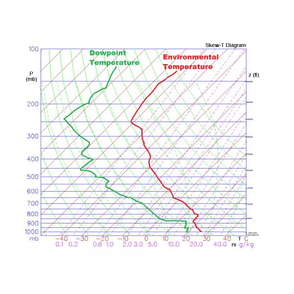 Example Skew-T Plot [4]
Being able to look at the temperature and dew point vertical profiles has several advantages. These profiles, and their comparison, allow one to assess instability in the atmosphere, as well as characterize severe weather and observe a variety of weather elements as they occur in each layer of the atmosphere. [2] Additionally, information gathered through radiosonde data and its plotting on a skew-t plot can be used to develop large-scale forecast models, by allowing the forecaster to look at a vertical “slice” of the earth’s atmosphere. [2]
A few caveats to be aware of when looking at a skew-t plot are that, as the data is collected via weather balloon ascent, the profile is not truly vertical, as there is some drift associated with the “float” of the balloon downstream, and that it is also not truly representative of an instant vertical slice of the atmosphere, as there are several minutes consumed by the ascent of the balloon, but it is typically close enough that these assumptions can be made. [2]
A plethora of information is contained in these somewhat-convoluted plots, and understanding the plot design helps in interpreting the data it contains. Firstly, the solid horizontal lines represent isobars, or areas of equal pressure. The pressure axis goes from 1050 mb, or roughly sea level, to 100 mb, plotted on a log scale. [3] Additionally, there are isotherms, or lines of equal temperature. These slope from the bottom left to the upper right, and their skewed nature is the namesake for the plot itself. Other reference lines on the plot include saturation mixing lines, adiabatic lapse rates, and wind speed and direction. I’m looking forward to learning to identify specific weather conditions through analyzing the skew-t plot!
[1] https://en.wikipedia.org/wiki/Skew-T_log-P_diagram [2] http://www.theweatherprediction.com/thermo/skewt/ [3] http://www.atmos.millersville.edu/~lead/SkewT_HowTo.html [4] http://wx4cast.blogspot.com/2011/10/how-to-read-skew-t-log-p.html
Taylor Regan, Summit Intern

Seek the Peak 2026: New Adventures, Rooted in Tradition
Seek the Peak 2026: New Adventures, Rooted in Tradition By MWOBS Staff Seek the Peak is Mount Washington Observatory's largest annual fundraiser, and for 26 years it's brought together hikers, adventurers, and people who
What “Prepared” Really Means in the White Mountains
What “Prepared” Really Means in the White Mountains Early Spring in the Whites: The Most Honest Season By Andrew Harris, Burgeon Outdoor If you’ve spent any time in New Hampshire’s White Mountains in March,
March on Mount Washington
March on Mount Washington By Ryan Knapp Looking towards Mt. Madison at sunset on March 21, 2026. The calendar has spoken: Friday, 20 March 2026, marked the first day of astronomical spring.
